COLOR COMBINATIONS FOR NEON SIGNS
TheNeon signs

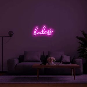
Neon ,Turning any word, phrase and even your thought into a beautiful piece of art.These Neon signs are a brilliant and alluring features, brightening you home, workplace. Having so many options available, deciding on designs that’s perfectly right for you. These neon signs are something which comes in almost any shape and color combination imagined by you. But to make something look attractive, the neon sign’s color should be something that can blend in your workspace best.
WHAT IS COLOR THEORY AND COLOR PSYCHOLOGY AND USE IN NEON SIGNS?
Color theory, color psychology plays the vital role in color combination.
In the visual art, color theory is a body of practical guidance to color mixing and the visual effects of a specific color combination. Color can allow anyone to create or express types of feelings, depending on the particular colors people utilize. Whereas color psychology is concerned, it’s a hues as a determination of human behavior. In other words it’s the properties and meaning of colors in our lives.
Color theory here refers to the guidelines that artists designers use to determine which color looks the best together. Colors are assigned to three levels, primary, secondary and tertiary levels. And then positioning them on the color wheel . This helps our artists to easily view the possible combinations, complementary and contrasting and harmonizing the colors.
While selecting the colors for your neon signs, do try to focus on two or three colors that complements each other well and also avoid creating too many contrasts. The analogous colors (the colors which are to be adjacent to one another on the color wheel ) are found together in nature and match each other nicely. To provide enough contrast without overwhelming the viewer with excessive color , try choosing an analogous color, Color specifying can dominate the scheme, with the others acting accent.
The principle of COLOR PSYCHOLOGY is to builds color theory guidelines. Color psychology studies color’s impact on human emotions and behavior. Color psychology is frequently used to impact consumer behavior in relation to marketing and advertising and should be taken into consideration hen choosing the colors for your custom neon sign design.
Impact

These Neon signs are sure to catch a customer’s eye regardless of color, you choose that color which helps to heighten the impact can. To make this more clear lets take red as an example, red is frequently associated with power, love and passion. Other eye-catching hues , orange and yellow , convey excitement and energy. While cooler colors tones, like blue, green, and purple, associate with peace and growth, and dependability.
Someone people , like simple and sober looks. And someone like light colors. Neon lights have 1.warm white- or soft white is a light with arm notes. The lighting is slightly yellow, offering a warm, comforting glow.
- pure white- or you can say bright white, is usually used in setting the commercials , as to decoration purpose.
Brightness and visibility
Neon is all about illumination and are often visible from a sizeable distance. The letters and font have a great impact in visibility, also the size of neon sign. Warmer toned colors, such as red , yellow and orange, may appear more vibrant than other colors and can increase your sign's overall visibility. Colors combine two primary colors such as turquoise, may appear slightly less bright than others and may not be visible from quite as great distance.
things to avoid
- try to avoid using dark colors together.
- Don't match everything.
- picking the wrong color for the setting.
- combining cool and warm colors.
- using color in equal proportions.
things to keep in mind;
- compementary colors
- contrast colors
- analogues color schemes
color combinations to use in neon
with RED ; yellow,white,green and blue. depending on interior.
with BROWN; cream,pink,light green. (bold clours like red and purple)
with ORANGE; blue, voilet or white custom neon lights.
with GREEN; orange, golden, reddish shades, blue or pink.
with BLUE; lilac, yellowish-green.
With PINK; white, green, blue or turquoise.
Color play a significant role in decorating and accentuating any form of design, style or decor. They are powerful, vibrant and can add life to any setting.
There are lots of companies offering neon lights to you all and Fancelite can be a great start. Fancelite is great for customized neon lights as you know you all be ordering from small suppliers so why not try fancelite. They provide you with fonts, colors, designs also with pre designed works too. View our neon work here https://fancelite.in.We have created this for you all to help you out with all your difficulties you are facing for neon signs. click here
You may have a look in, how the advertising neon sign make difference. Have a look in our official instagram page @fancelite.india